
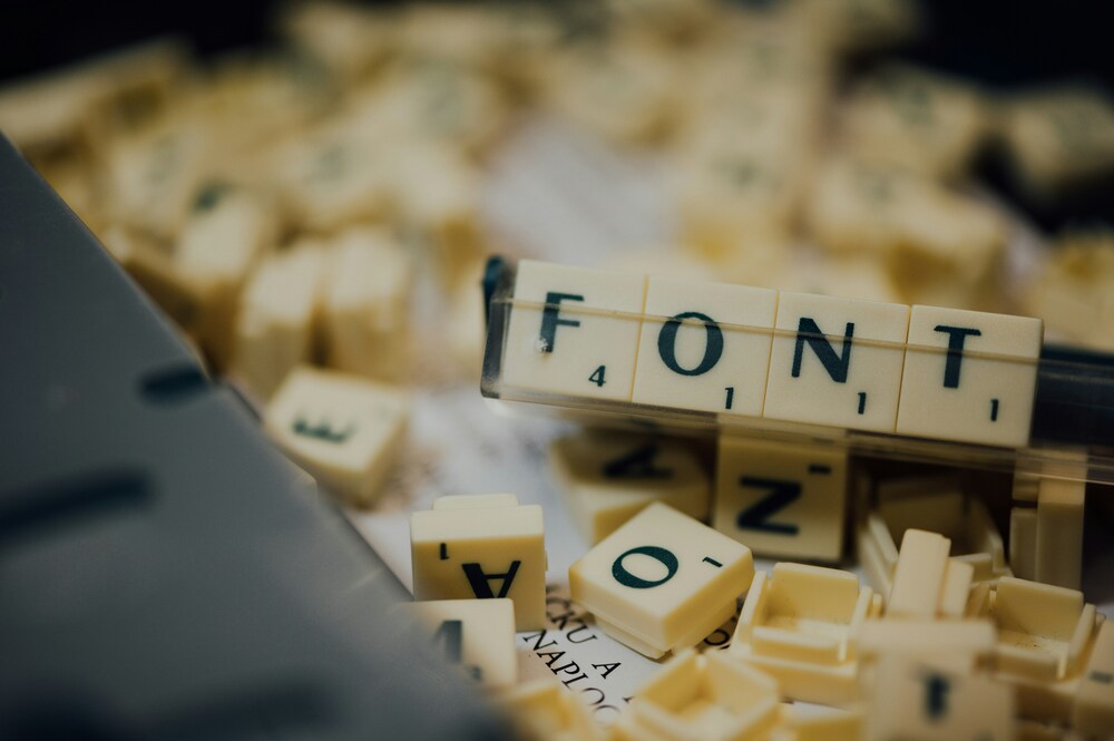
A practical guide to typography that helps your eBook look professional and easy to read.
Typography plays a quiet but powerful role in shaping how readers interact with an eBook. It influences the comfort, pace, and even enjoyment of reading. When the font is hard on the eyes or too small, readers are more likely to quit early. But when the right font and size are used, reading becomes easier and more fluid. This article explains how to make the right choices for font style and size, helping your eBook appear polished and user-friendly without relying on flashy design tricks or trends.
The foundation of any eBook layout starts with legibility. Unlike printed books, which are typically read under consistent lighting and with physical pages that offer some visual relief, eBooks are viewed on screens that vary greatly in resolution, lighting, and size. Readers might be using a smartphone on a train, a tablet in bed, or an e-reader on the beach. This range of reading contexts makes the choice of font and size more than a stylistic decision—it directly affects the experience.
Serif vs. Sans-Serif: Which Works Best for eBooks?
The first decision to make is whether to use a serif or sans-serif font. Serif fonts, like Georgia or Times New Roman, have small lines or strokes at the end of larger strokes. These were originally designed to guide the eye in printed materials. While they can work well on high-resolution screens, they sometimes appear crowded or blurry on lower-quality displays.
Sans-serif fonts like Helvetica, Arial, or Open Sans have cleaner lines and are usually more readable across devices. Their simpler shapes tend to hold up better in small sizes or on screens with less-than-perfect clarity. For this reason, many modern eBooks—especially nonfiction, manuals, or business content—use sans-serif fonts to support easier reading.
There are exceptions, of course. Fictional narratives, historical works, or literary collections might lean toward a more traditional serif font to match the tone of the content. Georgia is a strong example of a serif font designed with screen readability in mind. It blends classic elegance with clarity, making it a suitable compromise for those who prefer a traditional look.
Font Size: Comfort is Key
Choosing the right size is just as important as choosing the right font. While some platforms allow users to adjust font size themselves, many eBooks are read in fixed formats—particularly PDFs or formatted Kindle files—so the size chosen by the author or designer can directly affect readability.
A common mistake is using a size that appears fine on a large desktop monitor but becomes unreadable on a smaller tablet or phone. In most cases, a font size between 11 and 13 points is considered ideal for body text in eBooks. This size strikes a balance between fitting enough text on each screen and making it easy to read without zooming in.
Headers and subheaders should be distinctly larger to guide the reader. A good rule is to make H2 headers around 18 to 20 points and scale other headers accordingly. Consistency helps create a rhythm in the reading experience and supports better structure throughout the content.
Line spacing, also known as leading, should not be overlooked. Too tight, and the page becomes crowded. Too loose, and the eye has to work harder to move from one line to the next. A general rule is to use line spacing of 1.4 to 1.6 times the font size, which gives each line room to breathe.
Font Pairing: Avoiding Visual Clutter
Sometimes a single font isn’t enough to guide the reader. Using two complementary fonts—one for headers and one for body text—can provide a clean visual hierarchy. But this has to be done carefully. Choosing fonts that are too different from one another can distract and confuse the reader.
A common strategy is to pair a serif header font with a sans-serif body font, or vice versa. For example, using Merriweather for titles and Lato for body text creates a balanced, elegant look that also remains highly readable. Both fonts are designed for screen readability and maintain legibility across devices.
It’s best to avoid using more than two fonts in an eBook. Mixing too many styles creates visual noise and reduces consistency. Instead, use variations of the same font family—bold, italic, small caps—to differentiate content types like quotes, callouts, or emphasized words.
Screen vs. Print: Designing with Purpose
Fonts that look good on paper don’t always translate well to screens. While print books can rely on higher-resolution outputs and stable page layouts, eBooks need to adapt to the digital format.
Fonts such as Verdana, Tahoma, and Open Sans were created with screen readability in mind. These fonts have larger x-heights (the height of lowercase letters like “x”) and generous spacing, which makes them easier to read in small sizes. They also maintain clarity at different screen resolutions, which is useful since not every device offers high-definition clarity.
On the other hand, decorative fonts or handwriting styles should be used sparingly, if at all. While they might work well on covers or in chapter headings, they generally make body text harder to read. Instead of adding character, they interrupt the flow of the reading experience.
A simple test can help you decide whether a font is appropriate. Open a sample chapter on different devices—phone, tablet, and desktop. If you find yourself squinting or rereading sentences, the font likely isn’t suitable for long-form digital reading.
Accessibility and Readability Standards
Good typography also includes thinking about users who may have reading difficulties or visual impairments. Fonts that are too thin, too ornate, or too tightly spaced can make the experience harder for these readers.
Fonts such as Roboto, PT Sans, and Dyslexie were designed with readability and accessibility in mind. Some eBook platforms even allow readers to switch to special fonts for easier reading. If you’re designing your own EPUB or PDF, including options like these can make your content more inclusive.
Color contrast is another piece of the puzzle. Dark gray or black text on a white or off-white background is often the most comfortable choice. Avoid using bright colors or low contrast combinations, especially for large blocks of text.
Making your eBook accessible doesn’t mean making it boring—it means respecting the time and focus of the reader. Choosing fonts and sizes that work for a wide audience is part of producing high-quality content that feels professional without being flashy.
Final Thoughts on Designing for Readability
Typography in eBooks serves a practical purpose. It’s not decoration, but a tool to support the reader’s understanding and enjoyment of the material. While it may be tempting to experiment with ornate fonts or edgy layouts, simplicity tends to perform better across a wide range of devices and reading conditions.
Focus on clean, legible fonts like Open Sans, Lato, Georgia, and Merriweather. Keep the body font size between 11 and 13 points, with clear spacing and consistent headers. Choose font pairs that support readability, not just visual flair.
An eBook that reads smoothly and looks polished doesn’t require complex design. Instead, it relies on thoughtful typography choices that serve the content and the audience.